Overview
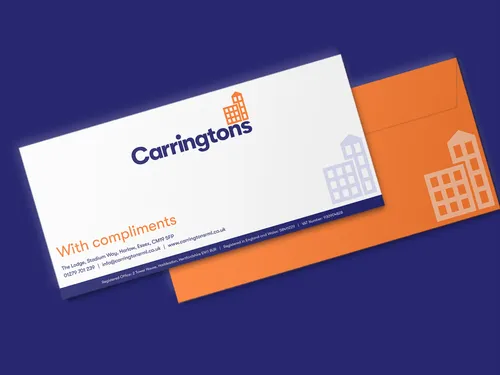
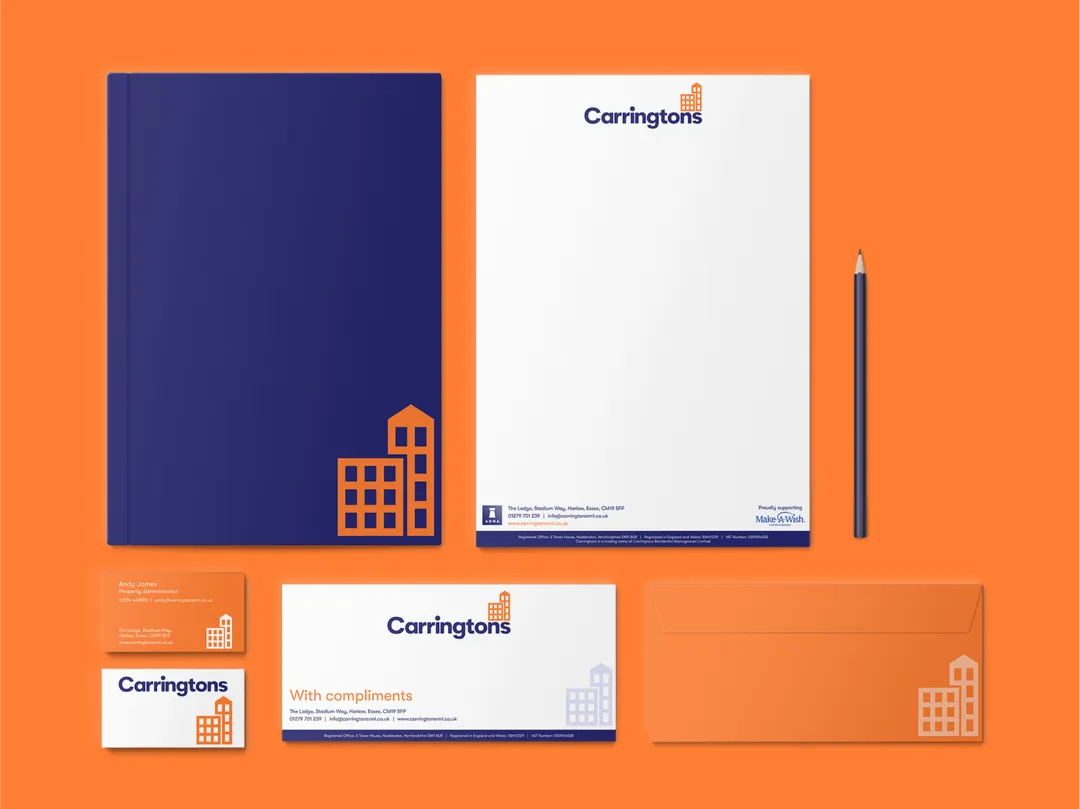
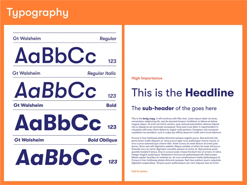
We helped Carringtons to update and strengthen their existing brand identity. We achieved this by first off reviewing the current guidelines and updating the existing logo to align with the brand's goals and values. We then created rules for logo usage, typography, colour combinations, and document layouts. We built the brand around their core values of reliability and trustworthiness. The company has established itself as a trusted partner for property owners and residential management companies. We’re excited to see what the future has in store for Carringtons!

Since commissioning Shoreditch Designs for some branding work, I have been constantly blown away by the team's professionalism and their ability to keep me informed of the project's progress on a regular basis. Andy, in particular, has always been very communicative from the start and has always encouraged my comments and opinions on drafts every step of the way. I believe we have found our design partner in Shoreditch Designs and I look forward to working with them again on new projects in the near future :-)

Our design thinking
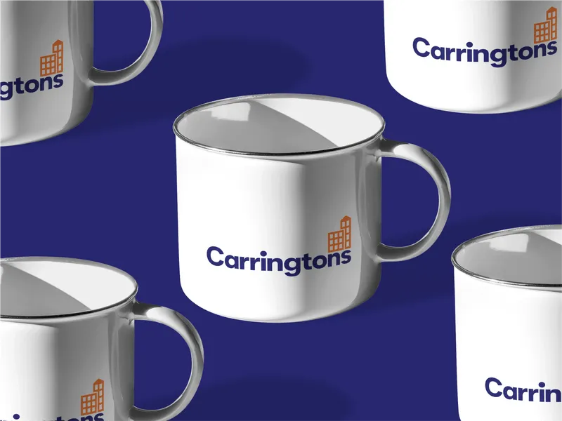
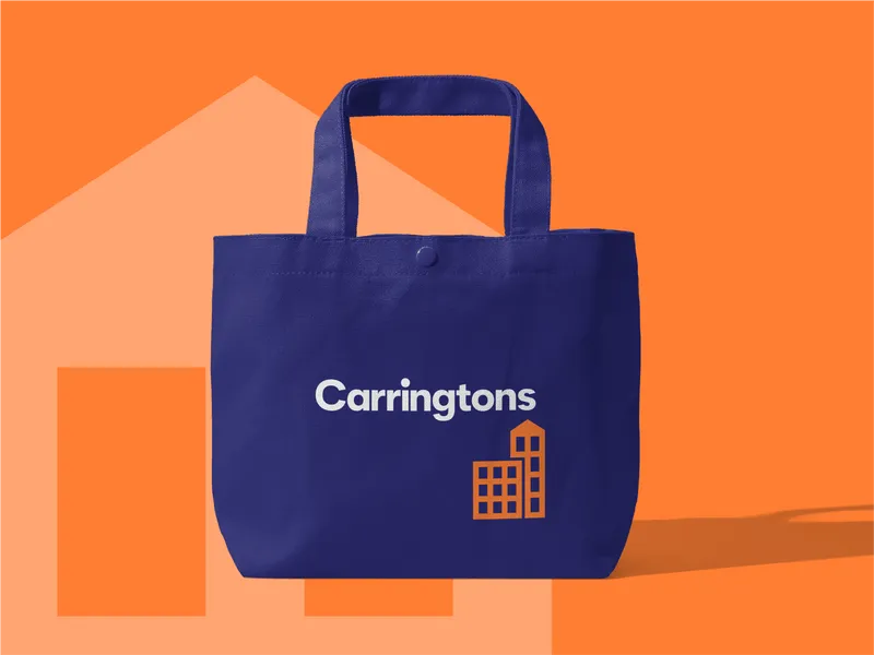
We kicked things off with a deep dive into Carringtons' existing brand elements. Then, we got creative and came up with three fresh logo options, playing around with different styles to see how far the client wanted to go—whether it was a full-blown rebrand or just a little makeover. Once the client gave the thumbs-up to their favorite logo, it was time to dive into crafting new brand guidelines. We put these guidelines to the test across various marketing materials until we were absolutely sure they hit the mark. This whole process ensured Carringtons got the modern and cohesive brand update they were looking for.
Finished product
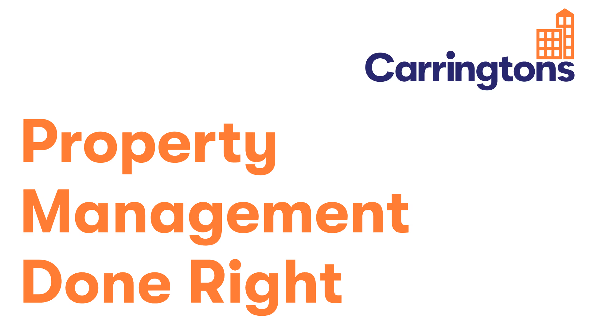
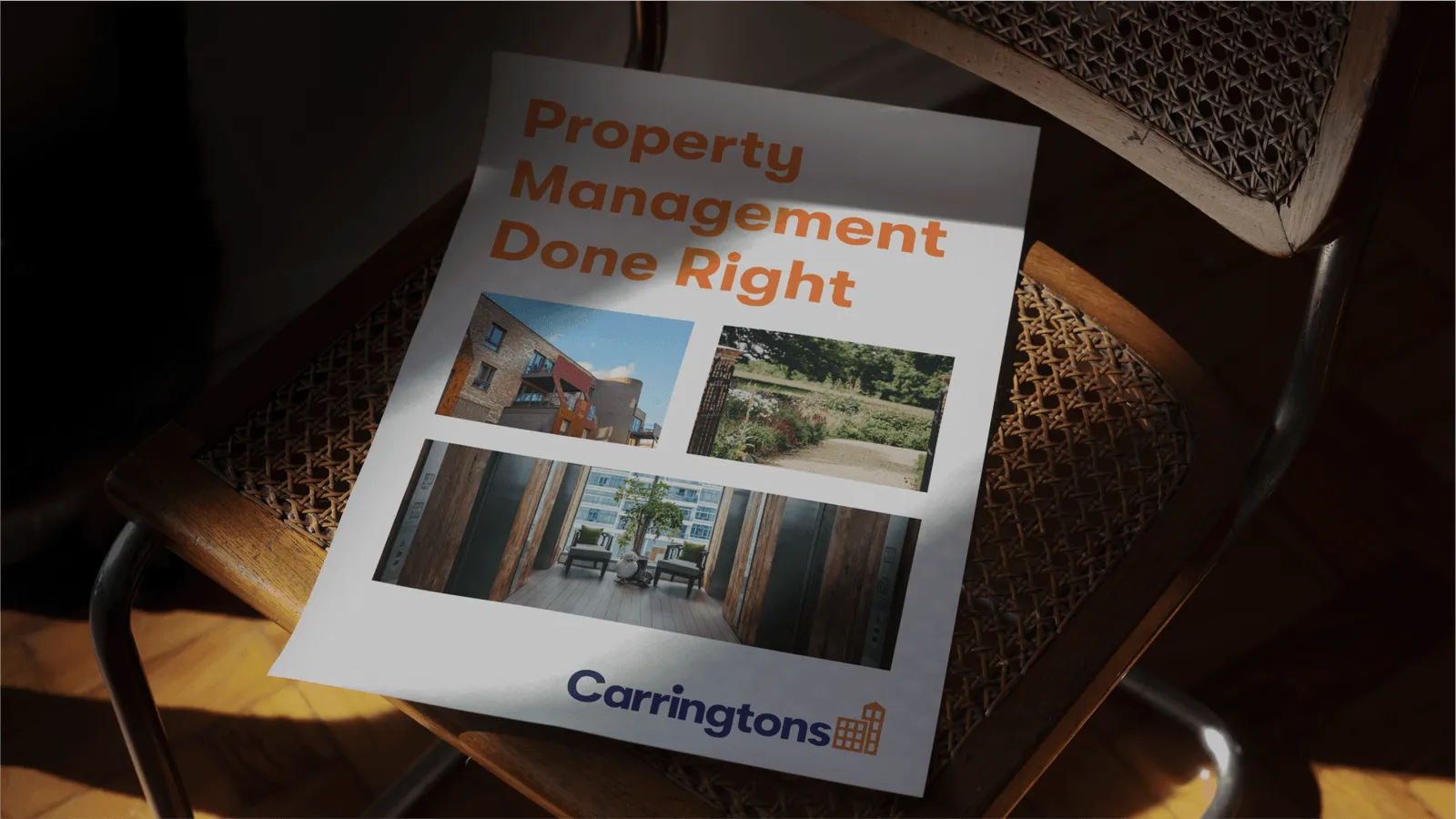
We worked closely with Carringtons to achieve a brand evolution. We made small but impactful changes to the colour, logo, and typography, giving Carringtons a modern refresh. We also delivered brand guidelines to provide a clear and structured framework for design and communication. Team members, designers, and partners can now easily understand how to represent the Carringtons brand visually.




Bring Your Idea to Life — Complimentary Design Session (Valued at $500)
Let’s explore your project, share relevant work, and discuss how we can help. In this mockup session, you'll get:
- Expert design insight tailored to your goals and audience
- Creative direction to help you start visualising your idea
- Clear next steps on how to bring your brand, website or product to life
We’ll bring ideas to the table — and if you like what you see, we’ll take it from there.
You can also get in touch at hello@shoreditchdesignstudio.com.au; Or give us a ring at 1800 979 771


