Design for the company that's simplifying and innovating the retail energy market
Overview
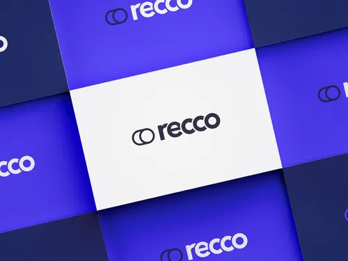
RECCo are an independent, proactive, and forward-looking non-profit company set up to simplify, improve, and facilitate innovation in the Retail Energy Market. We partnered with RECCo to create a meaningful identity reflecting the company's informed yet forward-thinking nature.

"The RECCo team have been a breeze to work with, turning complicated energy market terms into easy-to-digest plans for us to build on. The outcome was a fantastic brand, website and forward plan document that represents the company’s mission and its position in the digital landscape."

Our design thinking
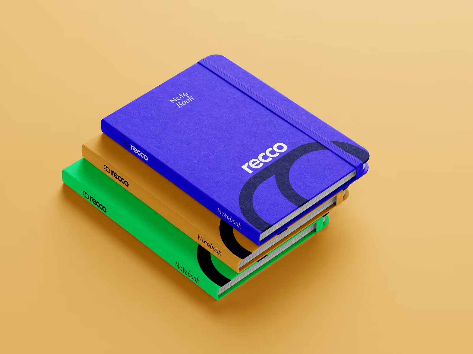
Working closely with the team at RECCo, through a series of workshops, we gathered a better understanding of the characteristics and emotions associated with the brand. We swiftly learnt that a classic but future-led aesthetic was the key. This duality forms many themes across the visual identity, from muted and bright colours in the palette to the pairing of traditional serifs with bold modern fonts.
Finished product
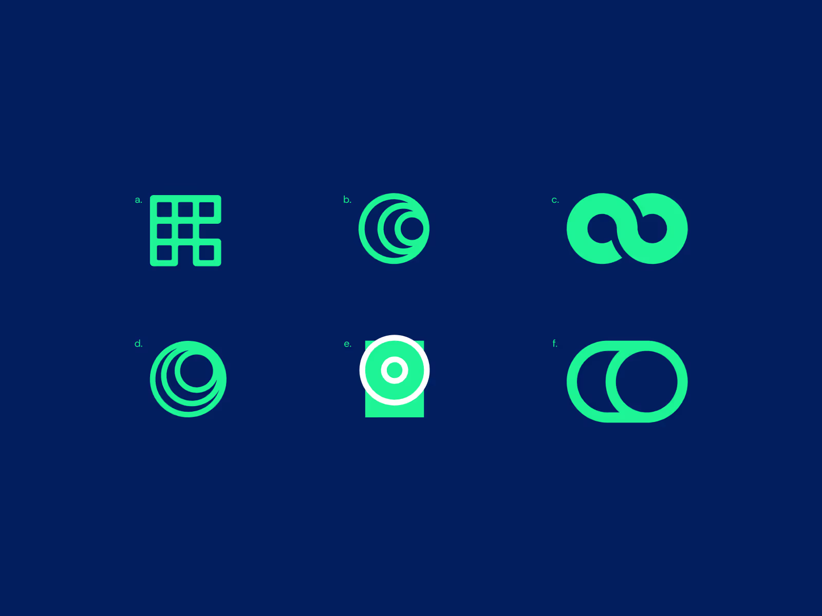
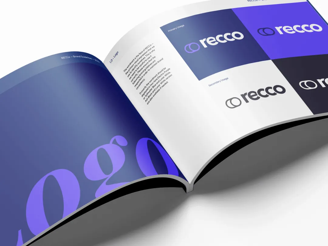
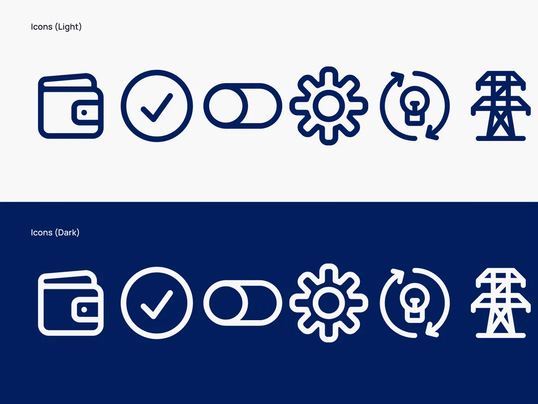
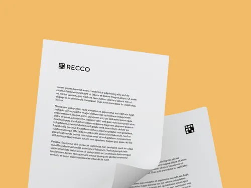
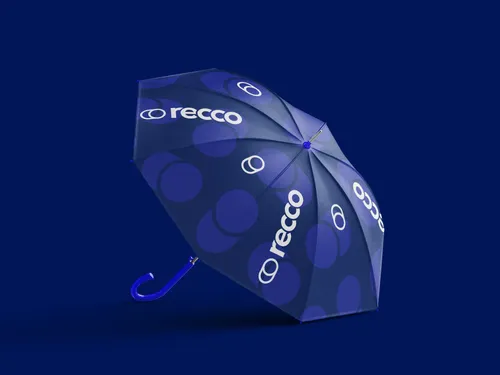
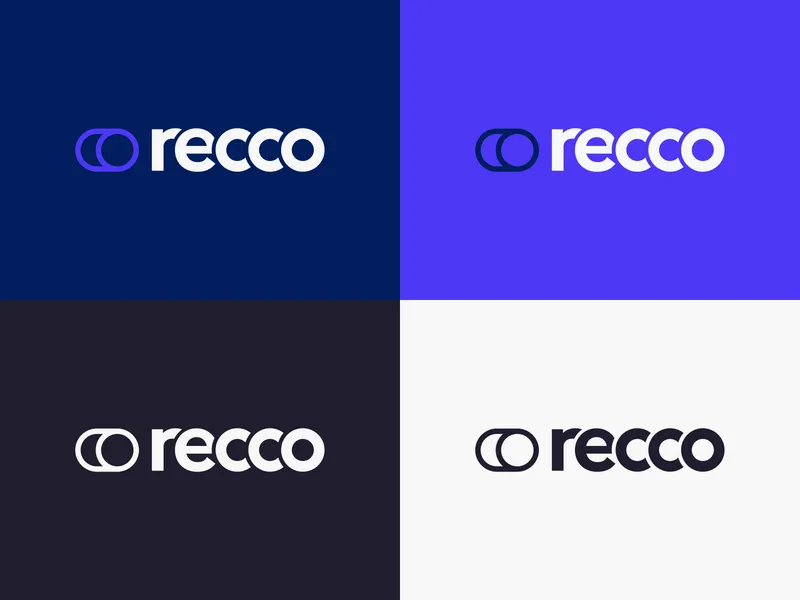
The RECCo brand has been fully reworked, using the missions and values that the company holds dear. The visual identity has been brought up to modern standards with a punchy new logo and colour palette. Whilst standing out in the crowded energy market, it also portrays the strong values of integrity and innovation within RECCo. We further expanded the new identity into the digital output, in the form of a new website and interactive documents, which have been built from the ground up. Leaning into accessibility and ease-of-use, the new digital touch-points have been built to streamline communications; allowing RECCo to edit out the bumf, and get to action.



Bring Your Idea to Life — Complimentary Design Session (Valued at $500)
Let’s explore your project, share relevant work, and discuss how we can help. In this mockup session, you'll get:
- Expert design insight tailored to your goals and audience
- Creative direction to help you start visualising your idea
- Clear next steps on how to bring your brand, website or product to life
We’ll bring ideas to the table — and if you like what you see, we’ll take it from there.
You can also get in touch at hello@shoreditchdesignstudio.com.au; Or give us a ring at 1800 979 771

