Forward-thinking design for the democratisation of financial health advice
Overview
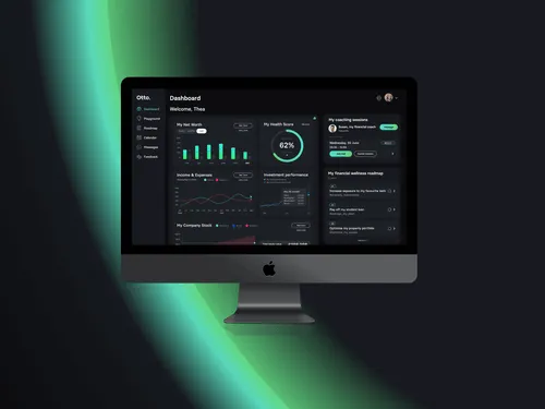
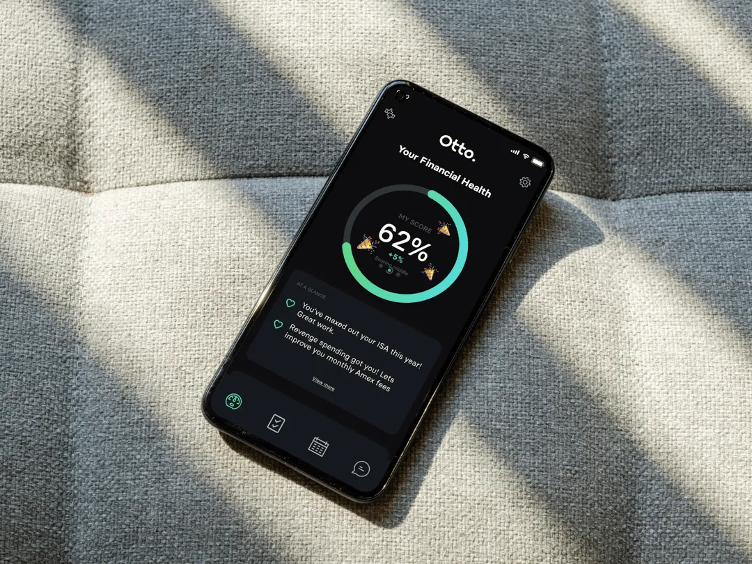
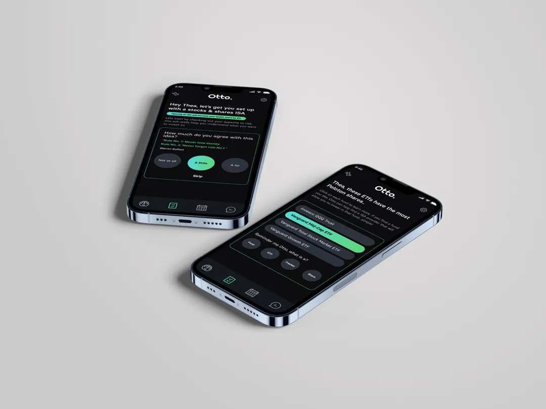
Otto is a newcomer fintech app on a mission to give access to financial advice and analysis to all. We worked with the founders from the off to create a new visual direction and a product with features that simplify financial advice for a mass market.

.avif)

"Have worked with Andrew and his team to design both the website and the app for my business. Couldn't have been more impressed with the quality of the designs, the responsiveness of the team and the speed of execution. It's the kind of team that gets it right the first time, while always willing to go the extra mile. Highly recommend!"

Our design thinking
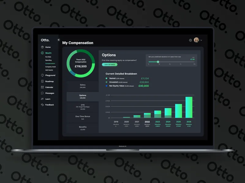
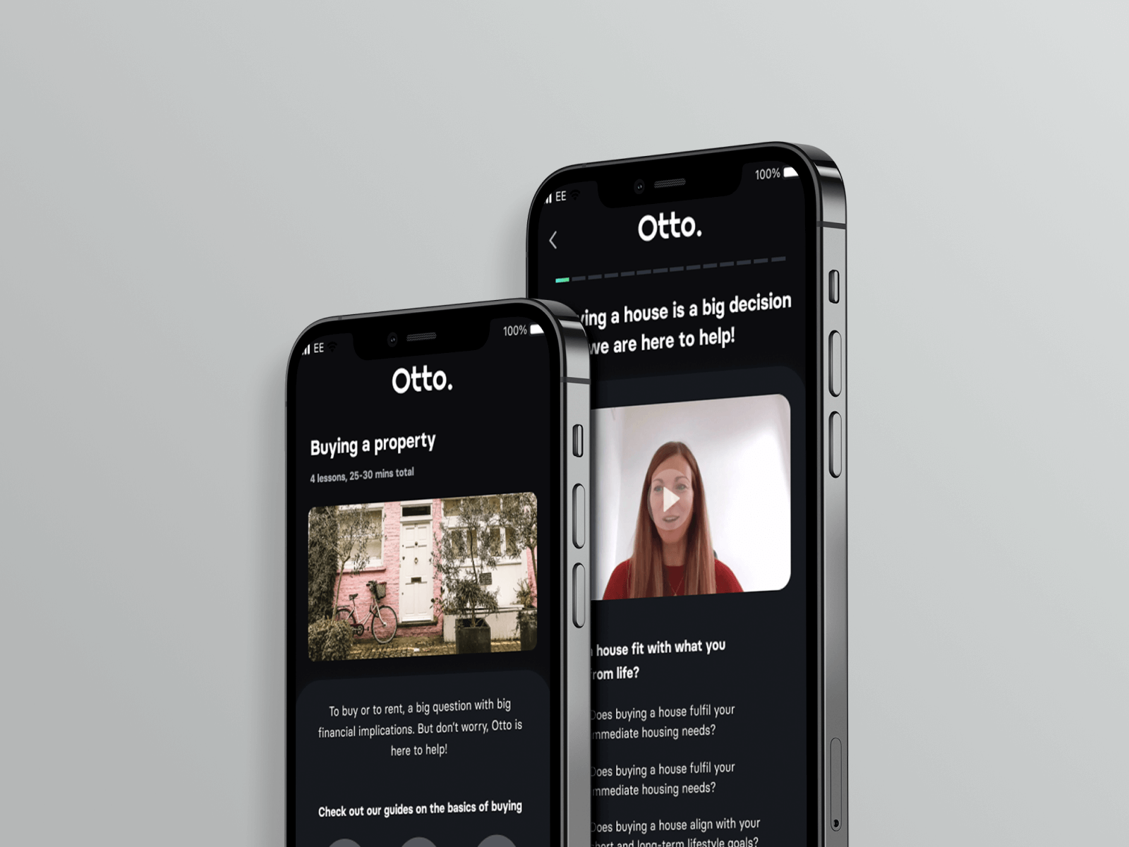
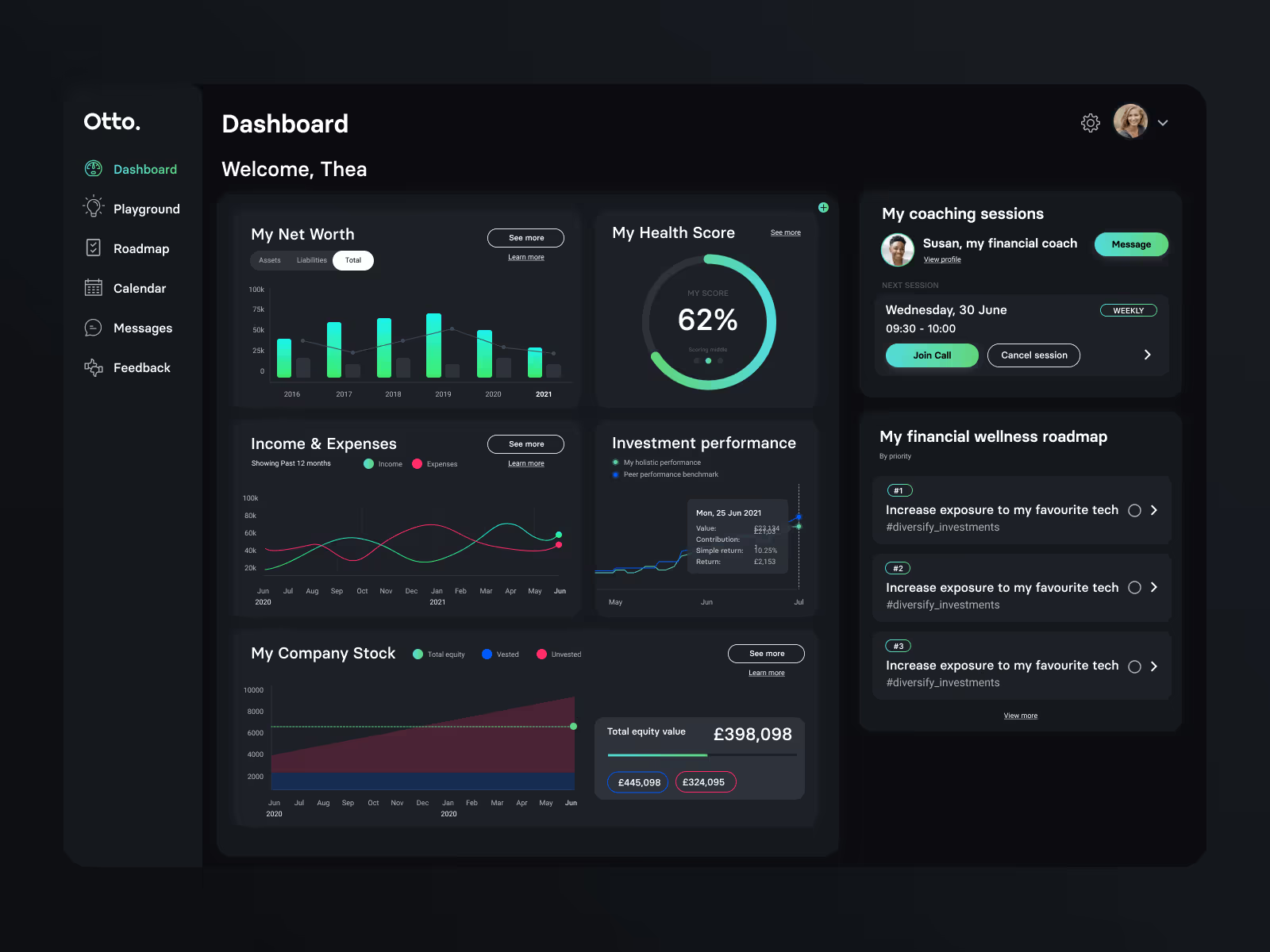
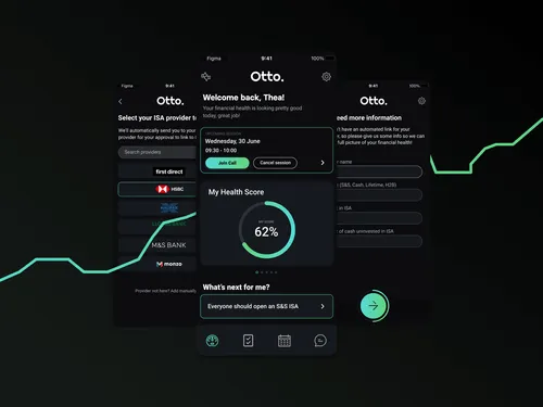
We stuck to a sparse and dark colour scheme to create a future-thinking aesthetic; we paired this with a streamlined sign-up process with rich data visuals. We had to fully comprehend the financial service to plan for the target user. Luckily our experience working for clients such as Aviva, Wise, and Natwest has given the Shoreditch team a thorough education in fintech.
Finished product
We took Otto from scribbles on a miro board and a logo to a fully-fledged design system and product prototype. Fintech is a Shoreditch speciality, so designing Otto was a fantastic display of our capabilities. The result is a clean website with electrifying visuals and straightforward user navigation.



Bring Your Idea to Life — Complimentary Design Session (Valued at $500)
Let’s explore your project, share relevant work, and discuss how we can help. In this mockup session, you'll get:
- Expert design insight tailored to your goals and audience
- Creative direction to help you start visualising your idea
- Clear next steps on how to bring your brand, website or product to life
We’ll bring ideas to the table — and if you like what you see, we’ll take it from there.
You can also get in touch at hello@shoreditchdesignstudio.com.au; Or give us a ring at 1800 979 771

